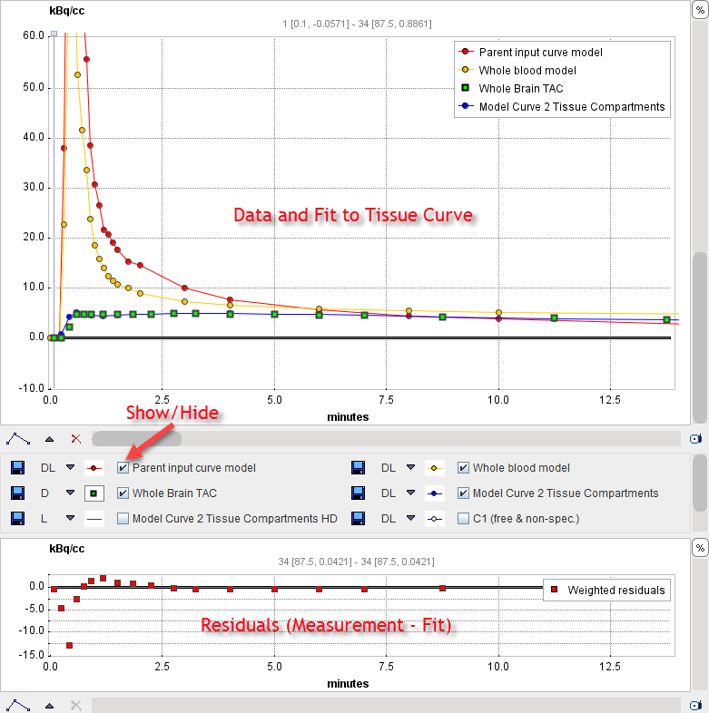
The curve display supports the visualization of the different loaded measurements as well as the calculated model curves. In PKIN the curves available for display depend on the selected tab (Tissue, Whole Blood, Plasma, Metabolites).
Curves with selected Tissue Tab
After loading all data, the time-activity information of the current region is shown in the curve display in a default layout. Note that the blood curves are initially switched off as they often have a much higher dynamic range and compress the tissue curve which is of main interest.
The curves available for display in the upper plotting area are:
▪the green TAC values representing the tissue TAC of the selected region, in the example the Whole Brain TAC;
▪the red Parent input curve model which is used as the input curve for the model calculations;
▪the yellow Whole blood model used for blood spillover corrections;
▪the blue Model Curve which results from evaluating the current model configuration with the input curve.
Per default, only the TAC and the Model Curve are enabled for display by the check box in the control area. Depending on the context, there are additional curves available for display but hidden (box not checked). In the example below the compartment concentrations C1 and C2 of the 2-Tissue compartment model as well as a finely resolved Model Curve HD could also be shown by checking their boxes.

The smaller curve display at the bottom visualizes the difference between the measured TAC and the model curve. Note that for screens with limited height it may be convenient switching the configuration to the layout with the curve controls to the right instead of below.
The general manipulations available in the PMOD curve display are explained in the next section.